
 |
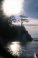
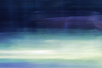
Lens flare is a well understood
problem. When something gets on the front element,
it causes a point light source that softens the image, and
can cause other aberrations. So put your camera in
an underwater case, cover the front lens with salt water
and let it dry in the sun for a while. The lens
flare is massive and the water drops actually bend the
image. Any image with this much flare should be garbage, but in this case it gives you a sense of just how warm it was to be out on the water - it makes you want to reach for your sun glasses. |
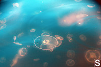 |
Lets face it, the ocean in Northern
BC is not normally cyan. Good pictures aren't
supposed to have vignetting at all - especially in just
two corners. And who puts jellyfish and clouds
together? That said, it does convey the emotion of watching jellyfish from a Kayak on a warm summer afternoon. |
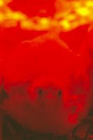 |
It was awfully greedy of
photographers to go from monochrome to three channel color
in one step - lets catch up the missing step. For
that matter, who really needs three dimension
lighting? The sun has been our point light source
since time eternal. If you look at the image large enough to see what's actually there, it's actually sharp, in focus and follows most of the standard composition rules (eyes on a third, catch light etc). It's just the color space (there is zero blue light coming from the heat lamp and the heat lamp is effectively the only light source) is weird. Must be pretty weird for these chickens to go outside and discover a whole new color they have never seen before. |
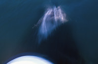 |
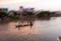
Most people like something sharp to
look at - it gives them the sense that their eyes work
correctly. Try watching a whale flirt with your bow
and leave because you are going to slow, and then express
that on film. A camera's ability to freeze a precise instant of time is unnatural. For me, this image is representative of the experience - there is sharpness in the water splashes, but not in the boat or the whale. For you, it's a reason to type something else in your browser bar. |
 |
Just because your camera is firmly
mounted to the tripod doesn't mean the tripod is firmly
connected to anything. In this particular example I
was taking photos at night when a couple walking down the
path were about to step on my camera. The camera was
taking a 15 second exposure and I had to pick the camera
up before the shutter closed or it would get stepped on. Even sharp, this image is abstract. (Those are tea lights in cut sections of bamboo) With motion, the abstract really becomes disconnected from reality and you get to see what you want to see. |
 |
Panning works best when you are
shooting something moving in a relatively straight
direction in a relatively predictable way for a relatively
short period of time. I was trying to take photos of
deer in low light (1 second exposures) with a long lens
and the deer were having nothing of it. Unfortunately, the contrast isn't quite up to standard. The black background and well lit grass take the panning well and provide a good canvas to paint the deer, but the deer is moving just a bit too fast - where he dwelled you can see a ghost. |
 |
Lenses fail in a number of
ways. Ghosting occurs when light reflects inside the
lens. This reflection occurs for a number of reasons
- uncoated lenses are more likely to flare and bright
spots (unpainted internal surfaces) add brightness.
Sadly, the most common reason for flares and ghosts is
dirt on the lens surfaces - preventable by a little bit of
cleaning. If the scene has uniform brightness (like
your sunny family photo on the grass) ghosting is in a the
noise floor. If your scene is painfully contrasty
(like fire against the night sky) ghosts gets bright
enough that you can see them. |
 |
Motion Blur takes on a number of
different forms. Minor motion blur (perhaps 2 /
focal length) is an annoyance - a reminder that you really
should have used a tripod. When your shutter speed
gets down to the near second range, your images take on
another quality - convolution. The trace of the
motion of your hand becomes a significant part of the
image. In this case you can pretty clearly see what I was trying to take a photo of, but because of the motion blur you can't see any single detail with clarity. The water was moving quite quickly and the glints of the sunset provided detail not integrated in the hand motion. Total freak image, but satisfying. |
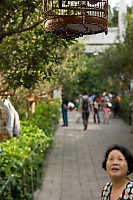 |
In general, I'm a big fan of looking
through the viewfinder before you take the photo. In
this case I held the camera up in roughly the right
direction and took a photo. The resulting photo is
terribly from a classical composition point of view - any
of the meaningful content is out of the 1/3rds and the
thing the eye is meant to focus on (the bird cage) is
mostly out of the frame. I think this photo works for a number of reasons. First, the cage is shiny which makes it high contrast which attracts your eye to it, more so that the tiny bird in the cage (which you can't see) would. Second, the woman is rendered strangely - looking small, tucked into the bottom corner - that you want to know what she is looking at. Beyond the camera being unnaturally high (2+ meters in the air), we are on a ramp which has foreshortened the scene and given her a forced perspective. I didn't look through the viewfinder before taking the photo so I really can't claim credit. |
Three different images, one photo
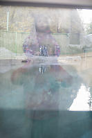 |
I have a really hard time taking
photos at the Vancouver Aquarium. You want a photo
of your kid enjoying themselves, learning something and
seeing an animal. Try not to dwell on the caged
animal. The problem is that you rarely get to take
a photo of both your kid and at the same time what they
are looking at without taking a photo of the back of
their head. It was a cold morning with lots of fog. The exhibit was in shadow so the brighter sky behind me actually overwhelmed the primary image. The water was quite flat so it acted as a mirror, furthering the effect. You can see the penguins but you can't really see the camera I am using to take the photo. This is such an unusual set of coincidences, there is no way you could casually reconstruct this type of image on demand - no skill is learned in seeing this photo. |
hahaha, out of the box, its like breaking the rules (if there's any)
kakilangit
Wednesday, August 6th, 2008 at 03:21:42
that last photo made me lose all respect for you i can't believe that you would even post that. It's an abomination in the world of photography. You have no soul.
taylor
Friday, October 31st, 2008 at 11:26:43
Cool! A dissenting opinion! As I say in the title: "images that I think are technically poor, but still (and much to my annoyance) are nice to look at it or otherwise compelling". I actually like this image because it reminds me of one of my favorite paintings by Monet: "Houses of Parliament, Effect of Sunlight in the Fog". But each their own.
John Harvey
Saturday, November 1st, 2008 at 19:17:26
Respond to taylor:
Your comment reminded me of criticising the expressionists in art history. When are we going to learn to leave the clichés?
Piadera
Saturday, January 17th, 2009 at 00:34:05
Now, that is cool! I've never thought about doing that sort of thing...I won't be deleting as many pics anymore. Love the pics.
Monday, November 16th, 2009 at 10:20:18
Thank you for posting that last photo. It's good to see that even a high caliber professional can produce something bad now and again. But seriously, thank you for the tips section since I have been following them I have noticed a massive amount of improvement in my technique.
Ivan
Monday, November 8th, 2010 at 02:30:21